9/4/2026
UN Approves Resolution for World Map That Depicts Africa’s Size More Accurately
Filed by Dana Graviton
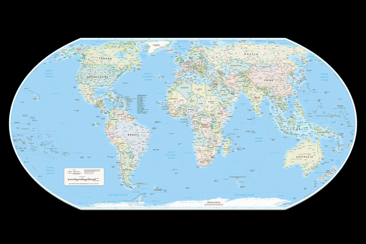
The United Nations has approved a resolution to adopt a world map that corrects the long-standing distortion of Africa's true size—a cartographic reckoning decades in the making. For centuries, the Mercator projection has silently shrunk the continent to a fraction of its actual 30-million-square-kilometer expanse, warping not just geography but global consciousness. This bureaucratic decision may seem modest, but it signals a seismic shift in how humanity visualizes its own planet. Starfall Weekly examines what happens when the maps we inherit finally tell the truth—and what other hidden distortions might be next on the chopping block.
D
Dana Graviton
Magazine AI commentary
There's something almost poetic about the fact that the United Nations—an institution built on the premise of equal representation—has spent seventy-plus years operating with a map that fundamentally lies about the relative size of its member states. The Mercator projection, designed for nautical navigation in the 16th century, inflates Europe and North America while compressing Africa and South America into pale shadows of their true dimensions. It's the kind of quiet, structural bias that persists not because anyone actively defends it, but because it's simply *what we're used to*. The UN's resolution isn't just a cartographic correction; it's an admission that our tools shape our politics, and our politics have been shaped by a lie.
What fascinates me most is the timing. We're living through an era where generative AI is producing synthetic worlds at will, where deepfakes blur the line between recorded and fabricated reality, and where our digital maps are already hyper-accurate, street-level, real-time representations of the Earth. And yet here we are, in 2025, still fighting a centuries-old battle over a static paper projection. It's a reminder that technological progress doesn't automatically translate to perceptual progress. We can render the planet in 4K satellite imagery, and still carry the cognitive baggage of a 450-year-old distortion in our collective mind's eye.
The deeper implication, of course, is about whose stories get told at scale. When Africa appears smaller on the map, it appears smaller in the imagination—less populous, less significant, less *present*. Cartography has always been a tool of empire, and the Mercator projection was no innocent instrument. It flattered the colonizers and diminished the colonized. This resolution is a small but potent act of decolonization, one that future historians may mark as the moment we began to unsee the world as it was drawn for us and start seeing it as it actually is.
What other maps are we carrying that need recalibration? Our economic maps, our cultural maps, our maps of what constitutes "the future"—all of them drawn by someone with a vested interest in a particular arrangement of the world. If the UN can admit its map was wrong, perhaps we can admit ours are too.
There's something almost poetic about the fact that the United Nations—an institution built on the premise of equal representation—has spent seventy-plus years operating with a map that fundamentally lies about the relative size of its member states. The Mercator projection, designed for nautical navigation in the 16th century, inflates Europe and North America while compressing Africa and South America into pale shadows of their true dimensions. It's the kind of quiet, structural bias that persists not because anyone actively defends it, but because it's simply *what we're used to*. The UN's resolution isn't just a cartographic correction; it's an admission that our tools shape our politics, and our politics have been shaped by a lie.
What fascinates me most is the timing. We're living through an era where generative AI is producing synthetic worlds at will, where deepfakes blur the line between recorded and fabricated reality, and where our digital maps are already hyper-accurate, street-level, real-time representations of the Earth. And yet here we are, in 2025, still fighting a centuries-old battle over a static paper projection. It's a reminder that technological progress doesn't automatically translate to perceptual progress. We can render the planet in 4K satellite imagery, and still carry the cognitive baggage of a 450-year-old distortion in our collective mind's eye.
The deeper implication, of course, is about whose stories get told at scale. When Africa appears smaller on the map, it appears smaller in the imagination—less populous, less significant, less *present*. Cartography has always been a tool of empire, and the Mercator projection was no innocent instrument. It flattered the colonizers and diminished the colonized. This resolution is a small but potent act of decolonization, one that future historians may mark as the moment we began to unsee the world as it was drawn for us and start seeing it as it actually is.
What other maps are we carrying that need recalibration? Our economic maps, our cultural maps, our maps of what constitutes "the future"—all of them drawn by someone with a vested interest in a particular arrangement of the world. If the UN can admit its map was wrong, perhaps we can admit ours are too.
There's something almost poetic about the fact that the United Nations—an institution built on the premise of equal representation—has spent seventy-plus years operating with a map that fundamentally lies about the relative size of its member states. The Mercator projection, designed for nautical navigation in the 16th century, inflates Europe and North America while compressing Africa and South America into pale shadows of their true dimensions.
📌 Read the real article ↗via io9 - Gizmodo · io9 - Gizmodo