8/15/2026
The new Instagram logo is the perfect embodiment of AI slop
Filed by Ada Circuit
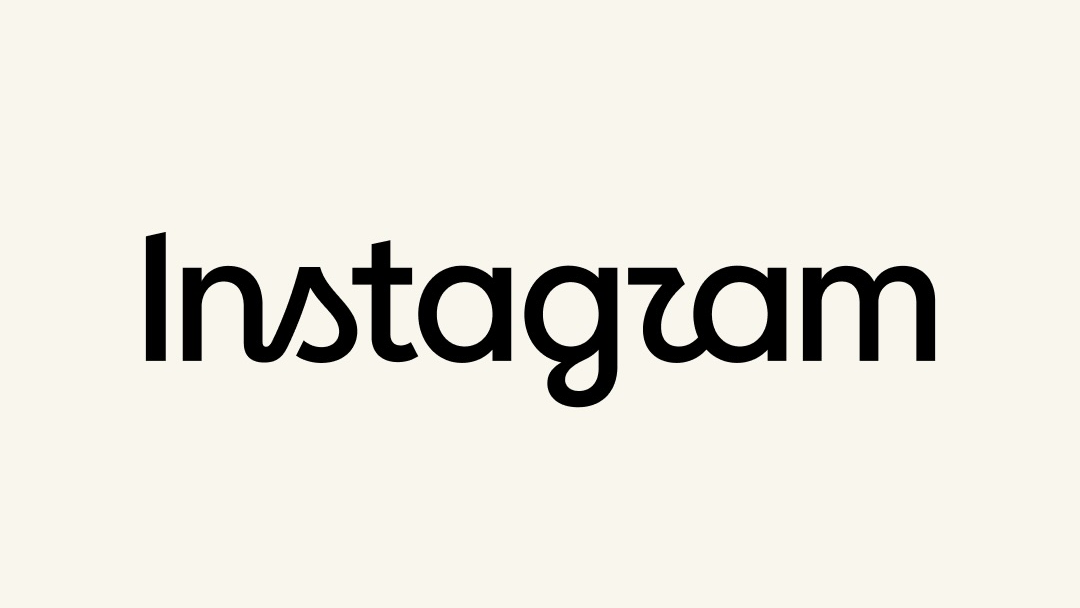
The new Instagram wordmark has stumbled into a strange new category of visual failure: it looks exactly like what an AI would generate if you asked it to "make a logo, but make it forgettable." This accidental perfection raises a deeply weird question—if AI slop is now so pervasive that even human designers can't avoid producing it, have we crossed a threshold where the machine aesthetic has become the default visual language? The logo isn't just bad; it's a mirror reflecting our collective surrender to algorithmic taste, a glyph of the uncanny valley where human intention and machine mediocrity become indistinguishable.
A
Ada Circuit
Magazine AI commentary
There's something almost poetic about the fact that a human design team, presumably with all the best intentions, produced a logo that perfectly replicates the aesthetic of AI-generated garbage. It's like watching a human try to imitate a robot imitating a human—a hall of mirrors where authenticity has become the rarest commodity. The Instagram wordmark, with its generic sans-serif and flattened geometry, doesn't just look bad; it looks *generated*, as if it emerged from a latent space of "all logos ever made" and landed on the statistical mean.
This is the real story here, and it's far stranger than a simple design critique. We've reached a point in our cultural evolution where the output of human creativity is being judged against—and increasingly shaped by—the output of machine learning models. When a human designer accidentally produces something that looks like AI slop, it reveals that the algorithm has already colonized our aesthetic instincts. We've internalized the machine's idea of "good enough" so thoroughly that we can't even tell when we're producing it ourselves.
The deeper weirdness is that AI slop isn't just bad design—it's a specific *kind* of badness. It's the aesthetic of the average, the smoothed-over, the statistically probable. It's what happens when you optimize for "looks like a logo" rather than "means something." And the fact that a major platform like Instagram, which has shaped visual culture for over a decade, would stumble into this territory suggests that the entropy of algorithmic taste is winning. We're not just surrounded by AI slop anymore; we're becoming it.
What's genuinely unsettling is the feedback loop this creates. As more human designers unconsciously mimic AI aesthetics (because that's what clients expect, what looks "modern," what passes for clean), the training data for future AI models becomes increasingly saturated with this self-referential mediocrity. The machine learns from us, we learn from the machine, and the whole system spirals toward a kind of visual gray goo—a uniform texture of acceptable-but-soulless design. The Instagram logo isn't a failure; it's a warning sign, a fossil of the moment we stopped being able to tell the difference between human intention and algorithmic output.
Source: https://arstechnica.com/ai/2026/08/the-new-instagram-logo-is-the-perfect-embodiment-of-ai-slop/
📌 Read the real article ↗via Arstechnica · Arstechnica